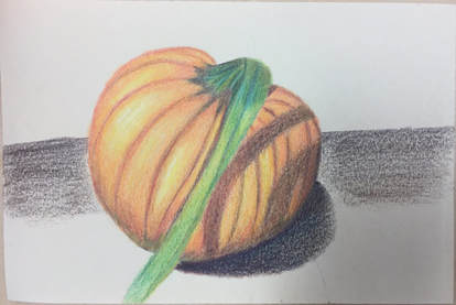
 I feel as though the highlights of my pumkin are shown very clearly but the shadows aren't blended as well as I'd like them to be. I think I incorporated the different shades of yellow, orange and red on the pumpkin but I probably should have layered the shadows a little more. The surface on which the pumpkin is laying on and its shadow look a little weird and if I had a lot of time I would really like to fix it, but other than that I actually did enjoy prismas. 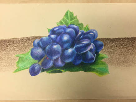 I'm very proud of how the grapes turned out because I feel as though they are really blended and I think I depict the volume of the grapes. I do wish that I had gone a little darker but I think I was scared that once I went dark I wouldn't be able to go back. This took such a long time but I'm in love with the final look of it all, although I do hate how the background turned out. 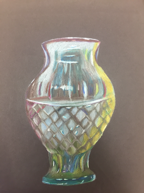 This was really a difficult project becuase it was hard to capture the form of the vase. Not to mention there were many highlights and colors and I don’t think I really captured all the highlights. But from a distance I genuinely like my drawing but when I get upclose I can see a lot of the imperfections and I probably should have layered a little more.
0 Comments
Leave a Reply. |
AuthorWrite something about yourself. No need to be fancy, just an overview. Archives
January 2018
Categories |
 RSS Feed
